

From splash to portrait: Alegría
This painting originated from an actual splash when I tossed some leftover paint onto a blank canvas at the end of an art class last summer. Someone remarked, "It kind of looks like a woman's face," which ignited the idea: "Let's see if I can create a portrait in the style of Ashvin Harrisson".
Harrisson is an Australian artist known for his distinctive style of merging charcoal drawings with acrylics and oil paints splattered on the canvas. I've been eager to experiment with this method of combining my two favorite mediums... So here it goes... 😃
Seeing a mark resembling an upward-looking eye, I searched for a royalty-free portrait of a woman gazing upward. Using Adobe Express, I placed her on the canvas to get a feel for the right proportions. Then, employing my newly acquired realistic drawing technique, I began sketching her onto the canvas with a sharp pencil.
Before applying charcoal to create shades and perfect shapes, I experimented with a small canvas. Canvas differs from paper, and I quickly understood why Harrisson uses charcoal dust and a brush. Charcoal pencils or sticks tend to highlight the texture of the canvas and don't provide a smooth, blended finish. Each painting holds a lesson... 😉


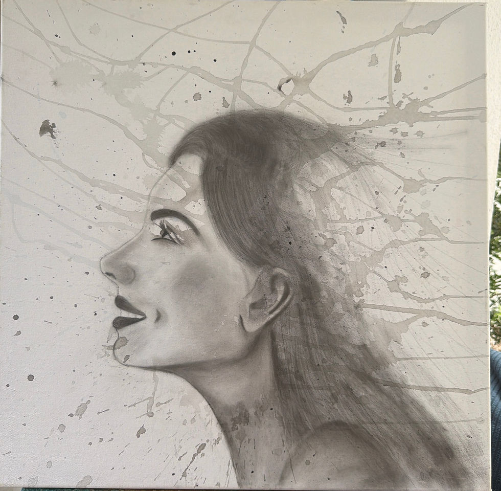
After applying the first layer of charcoal dust, I'm quite pleased with the results so far. She's beginning to take shape beautifully... 🤗
It's time to start adding some paint now... First, a black background for her flowing hair serves as the base for the color splashes. Then, I add splashes in various bright colors: red, orange, yellow, and gold....
After my first attempt, I'm not satisfied. 🤔 Somehow, I'm only getting drops, not splashes. Could my paint be too thin? Or is my brush too short?
Solution: Wash away most of the paint and try again...


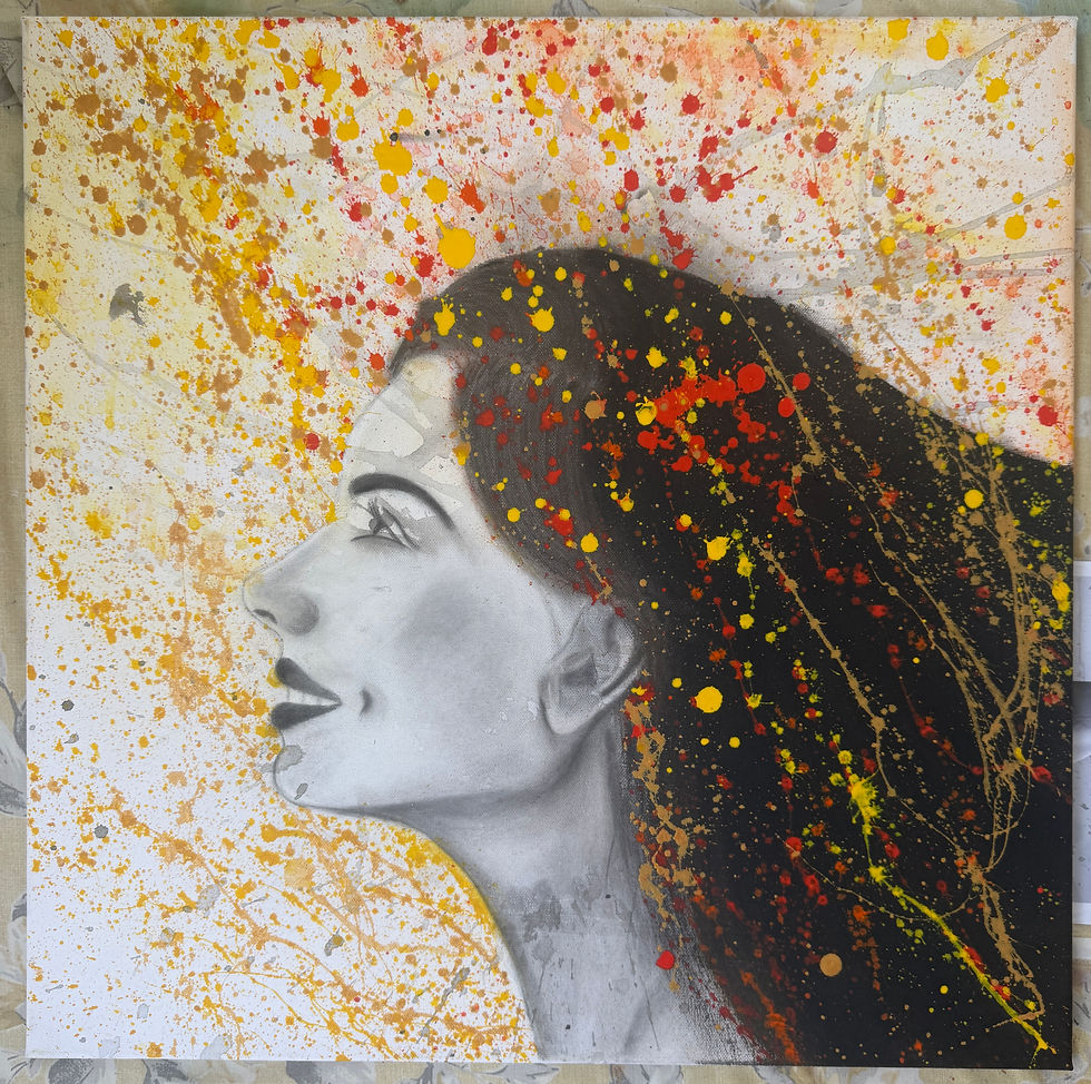
I like it now, but it's somewhat excessive. The balance is gone. Perhaps I've gone a bit overboard 😅... Note to self for the next one: don´t get carried away!

For the moment, once this layer is dry, I´ll splash some white over it to restore a bit of the balance and make it less ´all over the place´.
Yes, that's already an improvement...
Now, she just needs something to look at...
Since I'm naming this piece Alegría (Happiness), I've chosen a butterfly, which symbolizes freedom and happiness.


First I draw the outline with charcoal (using pencils this time, as they are easier to work with for small details).
And a touch of color completes it.
This was so much fun to do! I love combining charcoal and acrylics 😃
And I´m pretty happy with the result.
As with any new technique, it will require some time to refine... However, so far, so good.
Do tell me what you think!
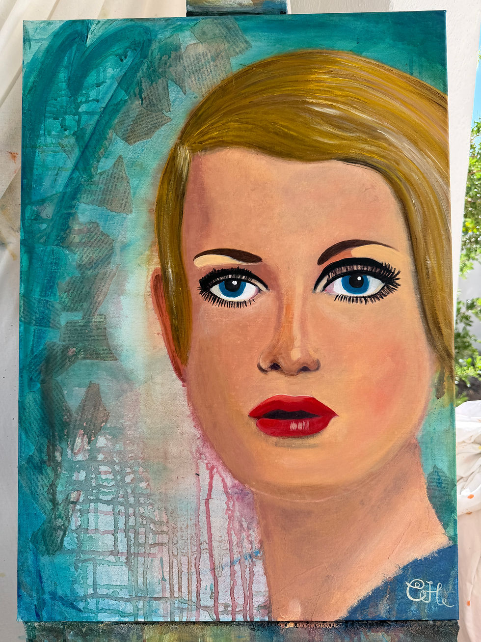


What a talented young lady you are.